Many gamers are eager to get their hands on the new Nintendo Switch 2 console. With its upgraded hardware, the hope is that laggy games on Switch will finally end with the Switch 2. However, the Switch 2 has one big problem facing it at launch and beyond, and that’s its games. Early reveals of pricing for Nintendo Switch 2 games left gamers shocked at the increase in cost for new Switch 2 games and upgrades to older titles alike. But price isn’t the only problem with Switch 2 games. There’s also the box art design, which is… a choice.
Though some gaming enthusiasts say it’s all about digital libraries these days, physical media is very much still alive and well. Influencers and casual gamers alike enjoy collecting physical game boxes to display their library. It’s both decor and a conversation piece, not to mention an insurance policy against games vanishing from online availability. But one element of displaying that physical game box is that you want it to look nice, and some elements of the early Switch 2 games we’ve seen are missing the mark.
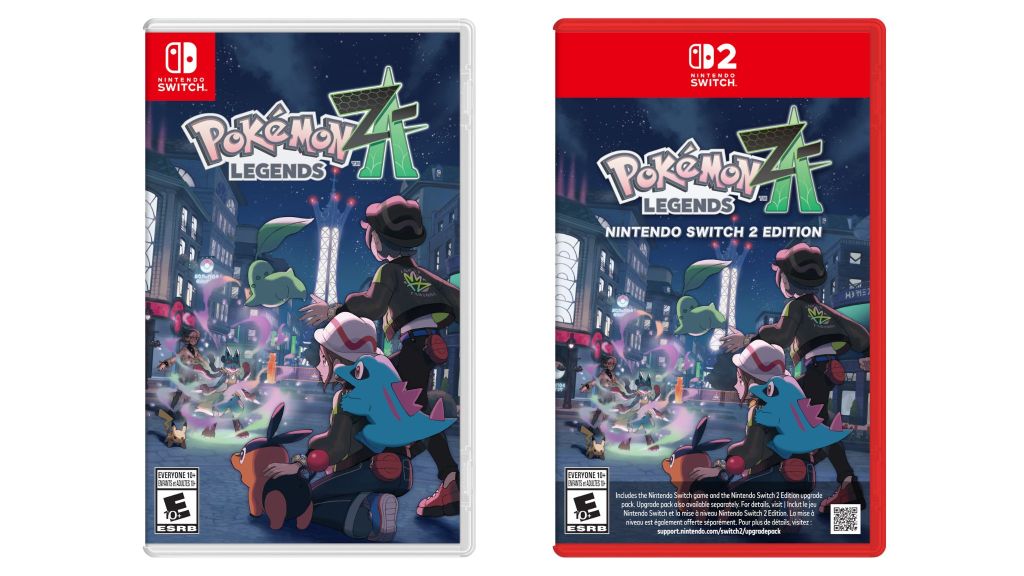
Because many games, including Pokemon Legends Z-A, are arriving for Switch and Switch 2, it’s easy to compare the direction that Nintendo’s box art is going. And that direction is interesting, to say the least. To be clear, I’m not here to throw shade at game key art or artists. Instead, what I’m talking about is the box design itself, the layout choices of how that key art gets displayed for Switch 2 boxes. While there’s always the chance these games will look different when they arrive in the real world, the digital mock-ups make it seem like Switch 2 game boxes will be some of the least attractive options to place on the shelf.
Nintendo Switch 2 Box Design Looks Like GameStop Used Game Replacement Art
The Nintendo Switch 2 physical game boxes we’ve seen so far show off a new style direction. For Switch games, the box is clear, with a small red Nintendo Switch logo in the corner. Apparently, there wasn’t enough of the classic Nintendo red. Switch 2 boxes, it appears, will be entirely red. That, I’m not necessarily mad at. We love a colorful box design. Xbox has had green game boxes in the past, while PlayStation vibes with a classic blue. But from there, it’s pretty much downhill with the aesthetics.
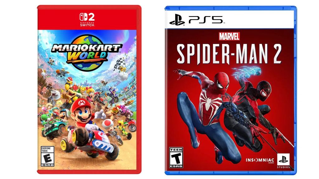
The Nintendo Switch 2 label at the top takes up a lot of space, with a full banner. That means the game’s actual key art has to be shrunk down to fit. In the case of Legends Z-A, that makes the art look oddly off-center and minimized. And it’s not just Pokemon that has this problem. Even Nintendo’s own games, like the day one launch game Mario Kart World, are sacrificing game art space for that Switch 2 banner at the top.
RELATED: Nintendo Switch 2 Has a Huge Streamer Problem
It didn’t have to be this way. After all, both Xbox and PlayStation use similar, smaller banners on their games that somehow manage to be less disruptive to the overall vibe. In part, the thinner box design is probably to blame, making the banner logo simply take up more of the available space. For me, the resulting effect reminds me of those old GameStop used game inserts. Remember how sometimes, if a used game no longer had the original case, they’d throw a little printout on a standard box instead? Something about the off-center game key art and big banner at the top for Switch 2 physical games brings me back to that vibe. In a used game situation, charming. With a game that costs $80 and is in its original case? Less so.
It’s not just me who thinks this, either. Graphic Design Reddit has a whole thread just talking about ways to rework the “disgustingly large” Nintendo Switch 2 banner on the game cases. And honestly, there are a lot of good ideas in there.
Obviously, the overall look of the box is small potatoes compared to how the games actually run. No matter how much less attractive that Legends Z-A Switch 2 cover is compared to the Switch 1 version, it’s almost definitely going to perform better on the newer console. Would the Switch version look better on your collector’s shelf? Probably. But aren’t we really here for a gaming experience with a better frame rate at the end of the day?
Even so, I’m kind of hoping that when I do first see a physical Nintendo Switch 2 game case in the wild, it doesn’t look quite as bad as the online mockups make it seem. Just another reason I’m not tempted to scramble for a Switch 2 on launch day.
Source: Nintendo Switch 2 Games Have Some of the Worst Box Art Ever


