Be sure to cast your votes in the poll below; but first, let’s check out the box art designs themselves.
Europe / North America
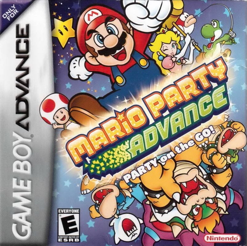
The European and North American design hardly goes all-out on the board game aesthetic (heck, if you didn’t know the series, then you’d be none the wiser looking at this), but it’s pretty nice on the eye all the same. Mario and pals all leap from the central logo, while Yoshi reels in a fish in the background. There are also some neat Koopa Kid colour variations here — looking uncannily similar to one Bowser Jr., we might add.
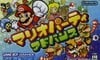
Japan
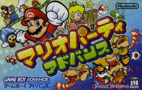
The Japanese box art makes use of the region’s rectangular formatting to pack in even more detail. A bunch of bonus characters make the cut on this one (including even more Koopa Kid colours) and we’re particular fans of the rollercoaster Luigi in the top left, even if it does look a little disjointed. All this is plastered over a starry background which seems fitting for the series when you think about it.
Thanks for voting! We’ll see you next time for another round of Box Art Brawl.


